Port scan results of large networks are usually only machine-readable. Nmap, arguably one of the most widely used port scanners, may offer a textual output that is human-readable for a handful of hosts, but becomes quickly unreadable in larger networks due to sheer size. The machine-readable output – usually in the form of XML files – is still very valuable for a pentester, but wouldn’t it be nice if we could actually get a vivid impression of what we are dealing with? That’s why we wrote a tool called “Scanscope” that attempts to visualize port scan results for humans.
It helps to understand the basics of linear algebra for what follows, but the pretty pictures at the end can be enjoyed by everyone! The target audience of this blog post are pentesters and defenders who want to take a more proactive approach to securing their network.
Motivation: Missing the forest for the trees
A port scan report by nmap for one host might look something like this:
1
2
3
4
5
6
7
8
9
10
11
12
13
14
15
16
17
18
19
20
21
22
23
24
25
26
27
28
29
30
31
32
Nmap scan report for 192.168.17.140
Host is up (0.00038s latency).
Not shown: 65509 filtered tcp ports (no-response)
PORT      STATE SERVICE
53/tcp    open  domain
80/tcp    open  http
88/tcp    open  kerberos-sec
135/tcp   open  msrpc
139/tcp   open  netbios-ssn
389/tcp   open  ldap
443/tcp   open  https
445/tcp   open  microsoft-ds
464/tcp   open  kpasswd5
593/tcp   open  http-rpc-epmap
636/tcp   open  ldapssl
3268/tcp  open  globalcatLDAP
3269/tcp  open  globalcatLDAPssl
3389/tcp  open  ms-wbt-server
5357/tcp  open  wsdapi
5985/tcp  open  wsman
8530/tcp  open  unknown
8531/tcp  open  unknown
9389/tcp  open  adws
49668/tcp open  unknown
49692/tcp open  unknown
49693/tcp open  unknown
49695/tcp open  unknown
49696/tcp open  unknown
49711/tcp open  unknown
49724/tcp open  unknown

Nmap done: 1 IP address (1 host up) scanned in 89.75 seconds
This is just for one host, and larger enterprises may have tens of thousands or even more machines in their network. Take the scan report above times ten thousand and you might get an idea of how futile it is to actually read the port scan result for a typical network. You can scroll over lines and lines of ports, but you won’t get an impression of how this network differs from the one you assessed the week before. You will see lots of hosts with a similar or even identical port configuration, but you won’t spot the ones that stand out. Crucially, these outliers remain central to proactive security strategies.
So one might wonder how a human-readable representation of a port scan result might look. Clearly, the total amount of information overwhelms the human mind, but perhaps it is possible to distill the information into something that is still characteristic for a particular network.
One possible way to go about this is to interpret the port scan result as vector space. Each port number corresponds to a dimension in this vector space, so any host corresponds to a vector
\[\mathbf v = \sum_{i=0}^{65535} p_i \mathbf e_i\,,\]where $i$ is the port number, and $p_i$ equals $1$ if the TCP port $i$ of that host is open and $0$ otherwise. As an example, a host which has TCP ports 22 (SSH) and 443 (HTTPS) open would be represented as the vector
\[\mathbf v = \mathbf e_{22} + \mathbf e_{443}\,.\]For UDP ports, we can simply multiply the port number with $-1$. Since there are $2^{16}$ port numbers for both TCP and UDP, we can trivially identify our vector space with $(\mathbb{F}_2)^{2^{17}}$, so a vector space over the finite field of order 2 with $2^{17}$ dimensions.
That’s a lot of dimensions! And it hardly makes it easier to visualize the data. However, now we’re on charted territory and we can apply well-known techniques known as dimensionality reduction. The idea is to reduce the dimensions from $2^{17}$ to two to get something that we can draw on a 2D chart. Hopefully, we can produce a map of the network where similar hosts (in terms of port configuration) are located nearby.
Methods and implementation: Trimming dimensions
To make our life a bit easier, we call hosts that have the exact same ports open “equivalent”, so we can speak of equivalence classes, or host groups.
Since the number of hosts in a host group should not influence the position of a host in the resulting 2D chart, we deduplicate the data set before the dimensionality reduction.
A classic method to reduce dimensions is Principal Component Analysis (PCA). It’s one of the oldest methods in the field and a natural first choice. Strictly speaking, PCA operates over $\mathbb{R}$, but the natural embedding of $(\mathbb{F}_2)^{2^{17}}$ into $\mathbb{R}^{2^{17}}$ makes this straightforward.
We also tested UMAP for dimensionality reduction. However, we found it to be quite heavy both in terms of size of the Python dependencies, as well as computational complexity. On top of that, the results did not convince us over PCA, qualitatively speaking. It either produced very tight clusters which required a lot more zooming in and out when exploring the chart, or host groups that we would expect to be nearby were on opposite sides of the chart. Also, unlike PCA, it is non-deterministic and produces a completely different result every time, which is undesirable when comparing charts of the same network at different times or from different scanning positions, for example. UMAP can be made reproducible, but that will cost us parallelization. Our data lives on the vertices of a high-dimensional hypercube. There is no curved manifold structure for UMAP to exploit, so its additional complexity buys us nothing over PCA.
Reducing dimensions from $2^{17}$ down to $2$ clearly represents a massive loss of information, but that is a necessary trade-off. In our tests, the first two components explain between 30% and 90% of the variance, with larger and more diverse networks typically at the higher end. This gives us confidence in our approach.
For assigning host groups to a cluster, we chose the HDBSCAN algorithm.
Because Python is arguably equally popular among pentesters and data scientists, it’s also a natural choice for Scanscope. Packages implementing the algorithms mentioned above are readily available.
As for the presentation: this wealth of information must be available in an interactive form. The most obvious and most widely supported format for this is HTML, but distributing several HTML and JavaScript files always creates a bit of friction. Luckily, there is a package called Zundler which can zip and bundle various assets into a single file.
This way, we can easily create an interactive web application compressed in a single file which contains all necessary assets. For best performance, we use an in-memory SQLite database, which is available as a JavaScript implementation using WASM.
The web application has the most common ports color coded to provide visual clues for similarities and differences between host groups. A tool tip shows the corresponding service as assigned by IANA.
The charts themselves are rendered using Bokeh. They allow you to drill down in the data and explore the network landscape. Host groups are displayed in a bubble chart, where the area of a bubble corresponds to the number of hosts in a host group. For the color of a bubble, we offer several color schemes:
- by cluster ID
- by category
- by port count (high port counts are red, low port counts are blue)
- by fingerprint (essentially a randomly assigned color)
Categories (web server, printer, e-mail, domain controller, etc.) are assigned to host groups using a crude heuristic approach. It’s not always clear to tell the purpose of a host just by looking at the open ports, especially since it can have multiple purposes, but it can provide a rough guide.
The position of a bubble is solely determined by the port configuration of the corresponding host group and the parameters of the reduction algorithm. However, the axes or coordinates have no particular meaning.
Interpretation and comments: Drawing tree maps
A typical bubble chart might look like this:
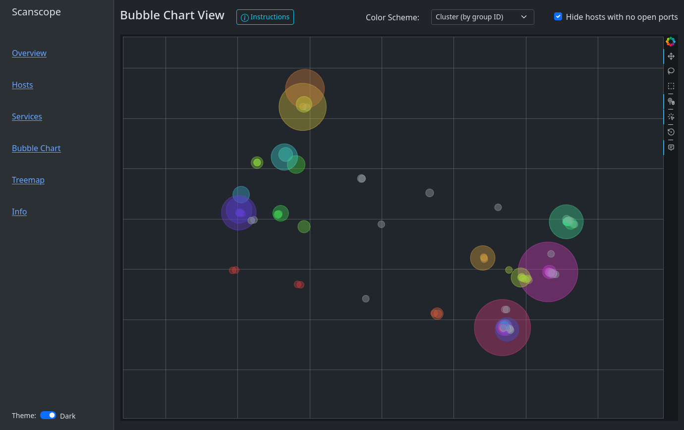
You’ll find that Windows hosts are usually on one side of the chart whereas Linux hosts or IoT devices are on another. That is because Windows hosts by default have ports 135, 139 and 445 open. Sometimes, a couple of high ports are open as well. Depending on the network, you might find Windows endpoints and Windows server separate from each other, where there might be an island of web servers in the server area. Or one might observe a group of database servers, where there is one little bubble nearby, representing a database server where the port for RDP (3389) has been left open. Maybe accidentally! My first goal when exploring the bubble chart is usually finding the domain controllers. Look out for those bold, yellow port badges!
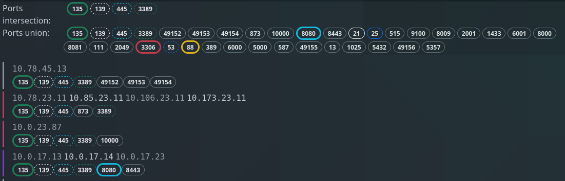
Clicking on a bubble or selecting several bubbles with the Box Select tool will show which IP addresses are in each host group. It shows the intersection of all ports, i.e. which ports all host groups have in common, as well as the union of all ports.
The tree map presents the same information in a different format:
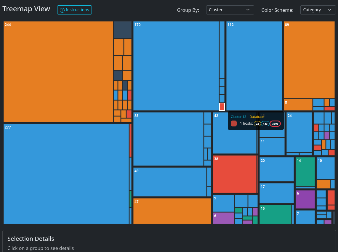
Clearly, the choice of which ports to scan will have an impact on the result.
Scanning all $2^{16}$ ports is not always feasible, but the more ports you
scan, the better the result will be. If time is a constraint, then a SYN scan of the
top 100 ports is a good compromise in a typical corporate network. Nmap has the
command line flag -F for selecting the top 100 ports.
And finally, an interactive demo! This is synthetic data, but comes quite close to a real portscan.
Conclusion: From seedlings to canopy
We presented a novel way to visualize port scan results using methods from machine learning and data mining. It can help identify outliers, compare port scan results as well as getting a first impression for various networks.
Scanscope is available on Github
and PyPI. Try it out now with pipx run
scanscope or uv tool run scanscope!